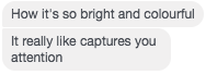
For this I created a mock up of my advert and asked for some audience feedback. After hearing from my target audience I decided to change some aspect of my poster to make them follow more of the colour scheme that I used in my digipak and in my music video.
Here is the initial design I created, following my flat plan almost exactly:
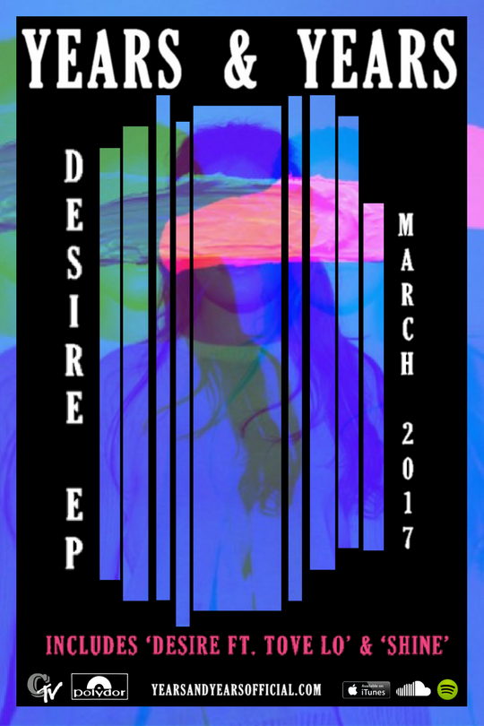
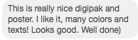
Some of the feedback I got on my mock up told me that there was too much green and the photo looked a bit busy and over edited. This prompted me to use a different, simpler version of the same photo (I also edited this photo and used it as my digipak cover). Below is the feedback I got that made me want to change the mock up picture:
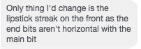
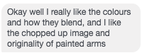
Below is some of the positive feedback I received for the advert poster after I changed the image:
![]()